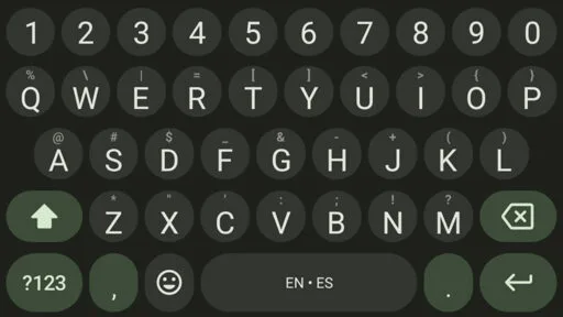
No one asked for this: Google is testing round keys in Gboard
No one asked for this: Google is testing round keys in Gboard
A lot of Gboard beta users are suddenly remembering they joined the beta.
-
For about a decade now google has been changing shit for no particular reason, this is just the latest.
-
That's just their way they keep it alive. If it were actually good, Google would cancel it.
-
One thing I did notice a while back, was seeing the 2022ish interface for YouTube and Google search and feeling how dated it was, still absolutely usable mind you, just clearly with a design ethos from an older era.
Most the time, I feel that changes Google make are absolutely arbitrary, rounding a button and then squaring it again, but I need to give them credit that there is something more, something about staying at the forefront of GUIs. It's still all bullshit of course, the old one looks older but is identically useful.
-
-
God how many things have changed on my phone that I did not ask them to. Changing the font on the clock. Changing the lock screen layout. REMOVING FROGGY WEATHER BEING BACK FROGGY YOU FUCKS.
Marketing and design teams just have to justify their existence. Makes for annoying stupid changes.
-
Don't get me started.
Gmail for business has been renamed at least four times.
Google Home changed layout for no particular reason and made everything an extra click away.
Google Assistant removed perfectly working actions, try turning on your A/C at 3am in the morning whilst you're sleeping.
Android changes navigation modes making everything worse.
Gmail keeps changing its layout.
Google Admin moves sections around for no reason.
Google search returns worse results every week.
Google Gemini is infecting every service.
Google Sites removed simple blogging functionality without any alternative.
Free services for life are now paid.
-
-
Basically, they have nothing else to do, so they just throw shit at the wall to see what sticks.
-
Sticky touchscreen for haptic feedback?
Sir, you earned yourself an extra piss break!
-
-
-
The fuck? If you’re gonna change the shape of the keys, at least make them hexagons. Because as we all know, hexagons are the bestagons.
-

-
Also then the clickable area would be bigger reducing errors. I tried a keyboard that did this once. Was a rough transition, but I managed. Unfortunately I ended up going back since it was lacking some other features.
-
Now show us your browser history.
-
Lots of Stand-up Mathematician?
-
-
-
We didn't ask for the red to pink colour fade on the Youtube playbar either but here we are...
-
Heliboard is the best right now
-
idk I prefer florisboard more in general
but currently they don't have any autocorrect or swipe typing
-
I wish there were a different gesture typing library to use... It makes so many annoying incorrect predictions.
-
It really is. Funny enough, I use the rounded style icons.
-
I hadn't heard of this one before; but a search of the play store is giving zero results. This one require side-loading?
-
You can install it with fdroid.
-
-
Is it better than FUTO?
-
I'm really enjoying FUTO.
-
-
-
Good time for FOSS keyboard apps to get some more love
Heliboard and Futo were the recommendations from what I remember?
-
Futo has been my favorite so far compared to other keyboards. I haven't used Heliboard yet, but it also looks like a good option.
-
I use the futo keyboard as well, but autocorrect and swiping is not good at all. correctly spelt words constantly gets changed for me, clipboard doesn't see what I copy too many times and swiping inaccuracy is too frequent.
only reason I put up with it is for the futo microphone. mic app is in a league of it's own
-
Futo works really nice! Glide is pretty decent, though not as good as gboard's. Wish it had custom background images though...
-
-
-
OpenBoard still works well for me. Including swiping and auto correct.
-
OpenBoard hasn't been updated for the last 3 years. HeliBoard is a continuation of the OpenBoard development, I highly recommend it.
-
-
-
Reminds me of this
-
What if google hired a translator so that they don't need to re-invent the wheel, they already perfected the design: https://www.youtube.com/watch?v=9G3DWHf1xX0
-
-
Circles are the worst possible shape in terms of making efficient use of the limited screen space available on a phone. The screen is rectangular and nearly everything we display falls into rectangular arrangements. Using circles just means there is less room on each key to show useful information, like the long-hold functions.
I'm not opposed to change, but change entirely for the sake of change usually produces bad results.
-
I'm right there with you. I hate the current trend of rounded corners on everything. I know designers say it is more aesthetically pleasing, but to me it just looks like wasted space.
-
I use GBoard (yeah I know, it's just really good, but yes I am aware of the privacy concerns), but I use it without shapes. The letters and hold-characters are just... there, placed around in a qwerty arrangement. No "buttons", so to say. I hope they don't remove that functionality.
-
-
Don't use gboard, rather download a keyboard from F-Droid and avoid the keylogging :-)
-
Which one do you use? I haven't found one that works as well as the Google one yet
-
HeliBoard is pretty nice
-
Simple keyboard. I went minimalistic
-
I've been using FUTO which is free and open source, has pretty good gesture typing, very good voice to text, and does not connect to the internet. I'm happy with it, but I'm also an idiot and most things make me happy.
Edit: I am wrong about freedom and open source. Don't listen to me. I still like the keyboard though.
-
-
-
Late-stage tech bros, devoid of innovation and flailing at their precious cup game.
I'm so over this garbage. RIP smartphones.
-
I wanna switch to FOSS alternatives but swiping is either funky (FUTO) or not available for now (Floris). I ended up downgrading gboard to an older version since all this emoji stuff (especially the bitmoji sticker nonsense) really grinds my gears.
-
Get Heliboard and then download a gesture library such as this: https://github.com/erkserkserks/openboard/blob/master/app/src/main/jniLibs/arm64-v8a/libjni_latinimegoogle.so
Heliboard is on F-Droid.
-
Oh my gosh, I don't think info like this is found anywhere on the internet, thank you.
-
Thank you so much internet stranger. Just made the switch!
-
-
Did you try Heliboard? It can be setup to swipe, though I mostly tap type. When i have used the swipe it has worked well though. I have been using it for over a year now and really like it.
-
Swiping seems to work fine on Heliboard (I guess because it uses the same proprietary library as gboard)
-
See, I guess my problem is I never liked gboard's swipe algorithms back when I used gboard. Cause man heliboard's swiping with the gboard library really pisses me off sometimes lol
-
-
-
I like this. But this should be an option.
-
g what? I only know Heliboard
-
All I want is for gboard to stop hijacking my default keyboard. I set futo for a reason and I meant it.
-
I switched to Heliboard and I couldn't be more happier! It is just as good as any proprietary keyboards.
-
FUTO keyboard. Try it. Say bye to gboard.
-
I periodically try FUTO. It's a great keyboard, except for its swiping support. That seems to be gradually improving, but it isn't quite there yet. Unfortunately that is how I do all my typing, so I keep going back to GBoard. I look forward to leaving it for good.
-
Ahh. I only use it occasionally. I'm bad at spelling and need the word predictions too much.
-
This has been my issue with every single FOSS keyboard. I can't live without swipe.
Edit: Forgot you could download a swipe library for heliboard Here by picking raw and then uploading it to heliboard in advanced settings>load gesture typing library.
-
-
No mandarin unfortunately
-
-
The keys are not even the size they are on the screen, what’s getting drawn is just a grid of letters. Touch keyboards are far more complicated than you think.
-
Yeah. I’m gonna guess this types about the same. This is probally just an aesthetic change for the appearance of being “New!”.
-
someone in that department is getting a promotion, I bet
-
-
-
Looks awful
-
maybe the idea is that round keys will have less typos than rectangular keys that are all touching each other?
-
They are most likely running an A/B test on exactly those metrics.
We'll know if it's successful if they roll it out in the end.
-
Hopefully with the more available space between the keys, then there will be less typos.
I type with my thump cause I like to use my phone one handed but I get a lot of typos due to that.
Florisboard beta keyboard lets you increase that available space even further by decreasing the letter size. It's still missing other features tho, like word suggestions, auto correct etc.
-
-
Kinda reminded me of this post
https://feddit.org/post/8032101
Albeit the kerning on those virtual keys are making me all itchy. Horrible horrible implementation from Google yet again when they could've done it right.
-
Gboard is so far the only one i know that actually works with my use case. Swiping with multiple languages active at once, and actually figuring out what I want to type.
I'm running it without Google services or network access.
-
SwiftKey also does this!
I really, really want to switch to a less, uh, commercial keyboard but none of the ones typically praised here (for good reason) support multilingual swiping.
-
-
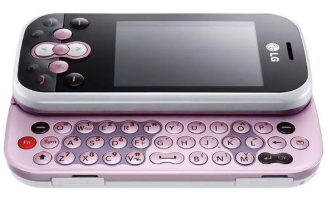
Try giving us back a fucking physical keyboard. Touchscreens fucking suck.
-
I disagree, but to each their own. You do have a potential option here:
-
Just carry a full sized usb keyboard to plug into your phone.
-
I'd really love a modern smartphone with a t9 keypad. I used to be able to type almost as fast on t9 as on a real keyboard. I miss it so much.
-
There's an app for that
https://play.google.com/store/apps/details?id=io.github.sspanak.tt9
It's not as good as a physical numpad, but it gets the job done
-
-
-
I've tried a few keyboards over the years, and the only one that I actually liked was actual malicious adware.
Looking forward to seeing good suggestions in this thread.
-
-
Definitely recommend Heliboard.
-
-
-
I've been following Google's material 3 since its release. There's pretty good examples of it, like the calculator app, but half of google's own apps don't follow their own guidelines, and they keep making changes to stray away and make their designs even uglier. Gboard was one of the final hopes for google's design. this better be a bug or something
-
Ew
-
Circles and round and we live them. Let's make all the buttons in our UI round.
- Google probably
-
Has anyone noticed gboard randomly closes now on Pixel 9? Can't find info about this issue anywhere.
-
🤮
-
If you happen to have a bingo in your hand, this comment is a free mark in the "this is why foss apps are better" spot. Though you have probably seen one already.