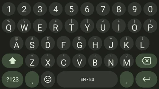
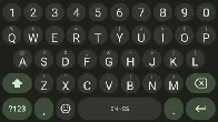
No one asked for this: Google is testing round keys in Gboard
No one asked for this: Google is testing round keys in Gboard
A lot of Gboard beta users are suddenly remembering they joined the beta.
You're viewing a single thread.
-
For about a decade now google has been changing shit for no particular reason, this is just the latest.
-
That's just their way they keep it alive. If it were actually good, Google would cancel it.
-
One thing I did notice a while back, was seeing the 2022ish interface for YouTube and Google search and feeling how dated it was, still absolutely usable mind you, just clearly with a design ethos from an older era.
Most the time, I feel that changes Google make are absolutely arbitrary, rounding a button and then squaring it again, but I need to give them credit that there is something more, something about staying at the forefront of GUIs. It's still all bullshit of course, the old one looks older but is identically useful.
-
-
The reason is their internal promotion culture. You cant get promoted without global impact, so buckle up we are changing things so we can get promoted not because it's better.
-
That's got to be the absolute worst KPI I've ever heard of.
-
It's a KPI you develop in the 00s culture of move fast and break things when the competition is at your heels and you want to be at theirs. You want to be the search engine that made the email client everyone uses otherwise that email client might make a search engine everyone uses…
It was outdated in the mid 10s, and it's the mid 20s now
-
-
-
God how many things have changed on my phone that I did not ask them to. Changing the font on the clock. Changing the lock screen layout. REMOVING FROGGY WEATHER BEING BACK FROGGY YOU FUCKS.
Marketing and design teams just have to justify their existence. Makes for annoying stupid changes.
-
Don't get me started.
Gmail for business has been renamed at least four times.
Google Home changed layout for no particular reason and made everything an extra click away.
Google Assistant removed perfectly working actions, try turning on your A/C at 3am in the morning whilst you're sleeping.
Android changes navigation modes making everything worse.
Gmail keeps changing its layout.
Google Admin moves sections around for no reason.
Google search returns worse results every week.
Google Gemini is infecting every service.
Google Sites removed simple blogging functionality without any alternative.
Free services for life are now paid.
-
Google Play moved the search button to the bottom but you still have to tap at the top to type your search, so it's just an extra click.
-
It still requires the extra click, but if you hit the search icon again then your keyboard will pop up. So no need to move your finger up top, Spotify's search has the same setup.
-
You just doubled my play store productivity.
-
-
When you launch chrome, you need to tap in the url bar to show the keyboard, so you can enter a search term or url, even when you start in incognito mode and have no bookmarks.
-
-
Paid for in my sanity seems like.
-
-
-
Basically, they have nothing else to do, so they just throw shit at the wall to see what sticks.
-
Sticky touchscreen for haptic feedback?
Sir, you earned yourself an extra piss break!
-
-
They learned it from Microsoft.
-
I have avoided Microsoft software for 25 years or so, so I don't have any reference point, but there was a time when Google lead the pack in innovation, that's no longer the case.
-
Google lead the way at buying innovation.
-
Mhm.
Innovate, Dominate, Stagnate, Enshittify.
Classic tech company lifecycle.
-
-
-