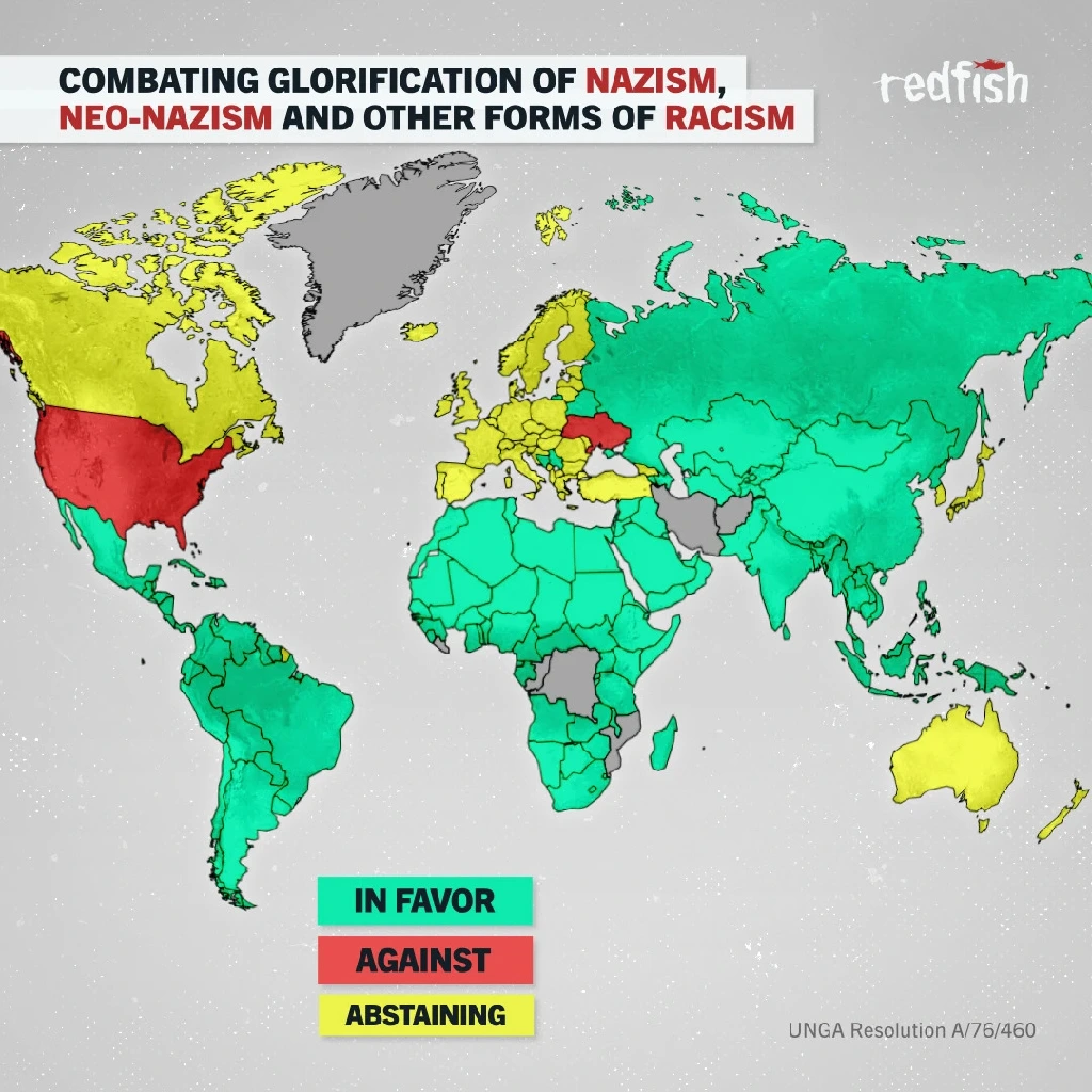
Yes! One easy/good one to use is https://webaim.org/resources/contrastchecker/
It lets you pick two colors, and you can even use the eyedropper tool in their Color Picker box to select a color right off your screen. Then it'll tell you the Contrast Ratio of the two selected colors. Higher is better. It will give you a pass/fail for WCAG AA and AAA (two levels of web accessibility standards).
I just now checked the red and green from the linked map and it had a ratio of 1.3:1 which is a fail for both AA and AAA.
Some websites (like Trello) give accessibility options to skip colors altogether, and use patterns (cross-hatch, polka-dot, etc.). But in general, going for a high enough contrast ratio should be good enough. I'm a web dev as well and we just run everything through one of those WCAG tools (I believe we've been using the WAVE browser plugin) and fix it until it passes. :) But, being the colorblind one on the team, I can often just be like "uhmm, that one ain't gonna work." lol.
btw sorry I got so spicy in my initial comment. I really wanted to see the map. :P
Edit:
Another reply to my comment had a link to a more colorblind-friendly version of the map, with red and blue instead of red and green. Much clearer to my eyes. I eyedropped those two colors into that webaim checker, and I was surprised to see it also failed quite badly on the color contrast! For example you wouldn't want red text on a blue background (unless it was a bright red and dark blue, or vice versa). But for map colors, well... I guess that goes to show that for colorblind checking you have to use a little common sense and know what the most common no-no combos are (red/green seems to be the most common).
I checked the accessibility docs at my work just now and we sometimes use this site to check what a site looks like under various types of colorblindness: https://www.toptal.com/designers/colorfilter

