
I agree wholeheartedly, it's readable, but oh so ugly and brutalistic :P
Why is that :D ?
Not that I disagree with you, as it's also my favorite, but just wanting to hear your reasons :)
You're not wrong about compactness, that's a really good point!
Thank you ! I'm a bit overwhelmed by the positive resonance so far, so now I'm wondering what to write after that will give me the same high haha :)
Now that you say that, I liked Aptos' G, but now I dislike it because it'll likely make things harder for people with poor eyesight.
I liked arial
OK, you're the only person who has managed to make me angry hehe :)
Someone actually likes Arial ??!!
Thank you so much, this sort of feedback warms my heart, it really does !
Feel free to stick around via the Mailinglist or the Fediverse (Y), links are in #whoami !
What are the “display” variants of the new fonts in that article? They're called that, at least on Office 365: Aptos Display, Grandview Display, etc.
but Aptos does look like an improvement
I think so too! Did you click through the Lorem Ipsum examples? Aptos is much easier on the eyes even in dense paragraphs.
I particularly like the serif added to the lowercase L
For the record, my calling those serifs has been a point of contention. To me Aptos feels like a semi-serif, not a sans-serif, although it's officially one! However, it's been suggested to me that I should do away with the serif terminology and call them simply stroke terminals!
Still mulling over this.
A Quick Look into Microsoft’s New Default Font
Personal activity log of lessons learned, obscure and not so obscure technical tidbits and even some philosophy rants, which are a by-product of my personal and professional comings and goings.

Hey Folks!
We've been playing and discussing Calibri, Aptos ( Bierstadt ), Grandview, Seaford, Tenorite and Skeena over on Tildes and I figured you folks would enjoy clicking around and seeing what the differences between them actually are.
I wrote the article, so let me know if there's something you'd like to see as well :D
Cheers !
Spoiler alert: you're the second person to suggest Iosevka, so I just added it to the comparison 🤠👍🏼
I must say I don't love it's narrowness, but it's really well made !
May I ask why? I'm not loving ligatures :[
I gave Julia's and Fira's ligatures a try but no dice, it feels so super counterintuitive 😬
Thanks a bunch! Yeah, that sounds about right, but also Julia and since some folks on Mastodon [1] told me also 0xProto 😂! Welcome to the rabbit hole!
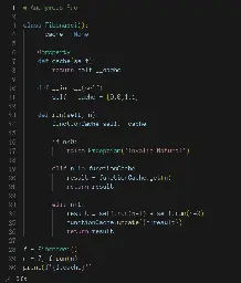
A Comparison of my Favorite Fonts for Reading and Writing Code
Personal activity log of lessons learned, obscure and not so obscure technical tidbits and even some philosophy rants, which are a by-product of my personal and professional comings and goings.