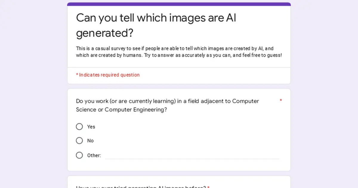
Some of these seem unfair because - if they're real images, they're images that resemble common errors, and if they're generated, they're examples of those errors being situational enough to look ambiguous. I can tell you what I'm looking at in each image. I can tell you where I've seen that misplaced or overused in a ton of generated images. But I can also tell you what humans tend to scribble out that might've been picked up by machines without me noticing, and I can explain some that-looks-suspect locations as mundane physical artifacts.
You could argue that's the point - demonstrating how far the technology has come in basically one year. But there's some cases where damn near anything is plausible, so long as it's locally sensible. Any close-up of a face might be from the "this person does not exist" kind of network, because with eight billion people on Earth, yeah, I'll believe that's a guy. But if you show me three pictures of the same alleged guy, I'm gonna know whether it's a real dude or a machine hallucination. Nature photos are similarly hard because nature's kinda anything-goes. Drawings, even moreso. There's not much difference between an AI going nuts on waterfalls because it has poor segmentation and a human who wanted to draw a clusterfuck of waterfalls.
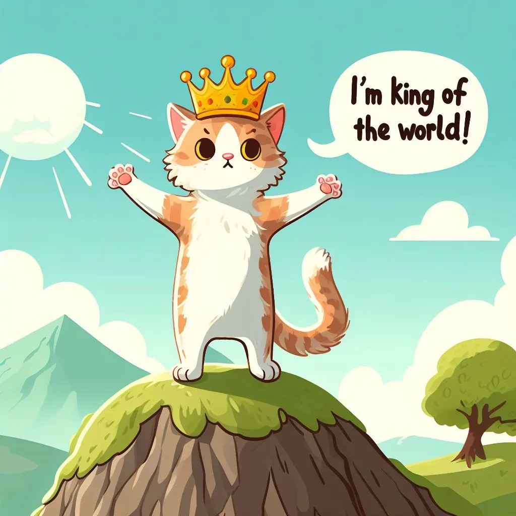
Here's what I'm looking at in each image. Her thumb's too good behind the glass, even if her fingernails are a little weird and the bench seat's not quite the same color on either side. His glasses are the only thing that's a little off, especially the gray-looking hairs on only his right temple, even though both could be perspective. His everything's too smooth; if this isn't generated then someone airbrushed a photo to death. Sketchy lines going nowhere and multiple approximations of a shape had me assume human over computer, but the bench's third leg and janked-up shadow point to a computer or a shitty artist. This guy looks filtered instead of drawn, but it might just be scratched instead of drawn, and honestly his wonky hold on the book is less concerning than the other image's bench. Perspective's all fucked-up and I'm unsure why the mouse is in a bucket, but the most computery parts are the fine detail in distant waves and up-close spray, because the high frequency doesn't match the drawing style. Except the next image has detailed asymmetrical elements and some smoke in front that only makes sense locally so I assumed these were human / generated pairs and marked the boat one as more-likely human. Fine stripey detail and repetition are suspect, as mentioned, make enough sense in this context that the distant foliage is almost more concerning. Rough painting originally had me mark this as human, versus the previous image, but where fine details appear (e.g. bottom left corner) they don't make any sense for a human to have focused on. Either a person did a shit job drawing those horses and really scribbled out a city, or this is exactly the sort of disordered localized detail some models add. (Honestly the scale birds and bottom-left white scribble are the only things that look like 'sloppy human' versus 'sloppy computer.') God rays on craggy waterfalls are the hardest call because humans might also draw this geological uncertainty; I marked it as generated because the smaller fall to the right finishes plausibly but starts from nowhere. Soft glow forest mountains are a generated cliche at this point. Monotonic crisp layers are not. Only the English text and rounded speech-bubble tail are tells at this point. An ice cream cat seems like the kind of dumb shit you'd ask an AI to do, but this is a tough call: there's three different kinds of "strawberry" here and they're not bungled together, but the pay and cookie placement seem bizarre in light of the rim of the fish-cone, and the placement of the beads is either cause for criticism of a human artist or shockingly flexible for a network. Lego image one could go either way. But Lego image two has cliche composition, an impossibly detailed plastic scarf, and asymmetric nonsense prints on her legs. Cat one is painted with consistent brushstrokes on everything but the whiskers. Cat two is either a painting filter or a person drawing badly from a photo reference. Cat three is the same warm-glow cliche that's easy to do on a computer, and if a human did that with actual paint, bravo.
11/20.
Everything photographic, I nailed. You picked some some lackluster human art.


![[Survey] Can you tell which images are AI generated?](https://lemmy.world/pictrs/image/10dc92e6-a763-49c8-b192-ead94f2c260f.png?format=webp&thumbnail=196)
