Skip Navigation
/kbin meta @kbin.social
FixedFun @kbin.social

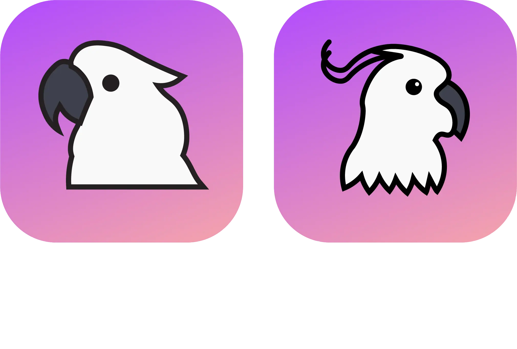
Here's my final idea for a Kbin mascot, I call it the "Kbird" (K = Kakatuá), since someone shared a Fediverse flag resembling a pirate flag I thought a bird mascot would fit.

114 comments
  • I, too, prefer the design on the left; however, If I may make a suggestion, I would flip it horizontally so the bird faces the right. As you know, western printed language flows from left to right; from a design perspective, the aesthetic of right-facing imagery subtly implies a "forward" direction, or moving forward to the future. Considering the purpose of this icon in this new frontier, I think that would be appropriate.

    Fantastic design, and I think the subtle gradient you dropped in the background is a nice touch.

  • I don't think Kbin needs a mascot. It needs to be its own thing rather than just a reddit 2.0.

    • I think Kbin does need a mascot, like everything has a mascot. For Tesla you got the T Logo thing, for Facebook you got the F Blue, for Twitter it's a white Bird

      Just my opinion tho

      • You mean like this one?

      • But...the letter T isn't a mascot. None of those are mascots. They're logos.

        I understand the need to lay claim to a place meant for individualized communication, but I'm personally a little annoyed by the insistence of it. I'm not interested in cute squishy mascots. Having a fun animal as the face of anything reminds me of every lame corporation's attempts to look appealing.

        I recognize there's little to no way I'm going to win this fight, but it's in the same vein as the continual server-specific nickname suggestions for functionally the same userbase speaking in the same shared forums.

        I think we're doing it because we're used to seeing companies do it, a la every one of them you mentioned. A bunch of us probably liked the Snoo, snoo was cute. It makes sense for newly ex-redditors to immediately remake their own snoo that is theirs and theirs alone and way better than the stinky reddit snoo.

        Being used to your company of choice having customer friendly anthro mascots and tribalistic nicknames doesn't make it something we need, and that I intended to leave all of that behind when I left isn't helping my bias in this.

        Especially where site-wide symbols like the ones you cited are concerned. I don't think I'm going to end up liking anything that's chosen simply because the kbin logo is already kbin, it was here when I got here, and I genuinely think it's really snazzy. Kudos to the designer who took two things I passionately hate — minimalist artwork and the color purple — and combined them into something enjoyable

      • tesla has a dog nose and it annoys the crap out of me. how does a dog nose connect to the invention of electricity in any way? it's not thematic at all. should have been a tesla coil.

  • If the community wants a mascot, the one on the left is certainly not a bad choice

  • I don't think kbin needs a mascot, but if it gets one, this should be it! I really like the design on the left, though I would try adding the white reflection from the one on the right.

  • I'm not fussed. Flying can openers are fine. Left preferred. Right one looks like a ghost just got out of the shower.

    I'm happy with the folder too, but appreciate you're aiming for a less tech oriented audience.

    • Right one looks like a ghost just got out of the shower.

      I'll never unsee that now. Why would you just say things like that out loud

  • I prefer the one on the left, but think it might be cool with one of the signature raised crests that make the bird unique .

  • I like the idea of a kbird.

    I agree with people saying it should look towards the right.

    I'm also fine with the general design idea of the one on the left but if this the final work, I will hard pass as the line work is extremely sloppy. Good for a first draft though.

    Edit: I'm really sorry if this is worded a bit harshly. I really love the idea behind the mascot and the general design language. I just have experience with design, not as a designer but a project manager, so I am sensitive to technical details. Line work and shape language are vague but extremely important parts of logo -or mascot in this case- design. Once the design on the left gets a professional polish pass to finalize it, it should work great.

    I would pay attention to line weight, as they are too skinny right now for the size of the bird, too many sharp corners creating a less welcoming shape language than I'd like, and line intersections aren't clean, disturbing the flow. The little bump on the back of the head looks a bit like someone gave the poor bird a whack rather than the natural shape of its head for example.

  • It's very cute! But flocks of cockatoos are deafening and I'm sure someone could read into that somehow 😅

  • A lot of people her focusing on why kbin doesnt "need" this right now..

    Its a cool mascot. You volunteered your time to make something neat for the community. Good Job.

    Awesome stuff, even if kbin doesn't need a mascot, its great to have.

  • I like the one on the left. The right one has fine details which may not look right as a tiny phone app icon or something.

  • The one on the left looks cute. I don't know if kbin needs a mascot, but if it does I vote for that one. The cuter the better.

    P.S: If it was up to me all mascots would be frogs, but hey this is a democracy.

  • It's a nice image the one on the left, though I hope we stick with the original logo when it comes to the favicon and the progressive web app, it's a nice shaped and styled logo with a be good color

    Cheers for the creativity though on that mascot image!

    • Yeah I don't want the Kbird to replace the folder, just a supplementary mascot

  • Tired of birds or at least pushover birds not going to lie. It's never anything 🅒🅞🅞🅛
    Robots are boring at this point too.

  • I like the folder, sure, but these have so much character. Left is popular but the right is adorable. Love it, good job!

  • I agree that Kbin could use a mascot (not necessarily need a mascot), but IMO the current proposals are not furry enough in this year of the Fediverse of 2023.

  • I really like the look of this, especially the one on the right, good job

  • This is the first one of these I've liked enough to comment on, and I really really love this.

114 comments