Image Transcription: Line Graph
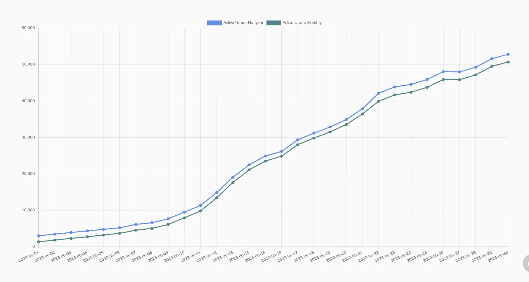
[A line graph is shown depicting the number of users on Lemmy over one month's time. The horizontal axis lists the date of each reading, with an interval shown for every day. The earliest date begins at '2023-05-28' and the most recent date is given as '2023-06-26'. The vertical axis measures the number of users, with intervals marked at every 5,000 users, with an upper limit of 50,000 users. There is a green trend like and a blue trend line graphed from plot points at every horizontal interval. The green line is labelled 'Active users monthly' shows increase over time. The line remains flat at approximately 1,000 users from the '05-28' date mark to the '05-31' mark, then begins to gradually increase to approximately 10,000 users, starting to show a trend similar to the beginning of an exponential growth curve. At the '06-11' date mark, the line begins increasing at a relatively steady rate, with the last marked date showing just over 45,000 users. There are two points in which the line shows an apparent indication of levelling off in user count, before then showing a sudden increase in users again, with neither of these points significantly impacting the overall upward trend. These points are at the dates '06-16' and '06-21'. The second graphed line, the blue line, is labelled 'Active Users Half year' and starts at approximately 3,000 users, but follows an almost identical trend shape as the green line as it increases approximately parallel to it. The blue line ends at around 48,000 users at the final graphed point.]
I'm a human volunteer transcribing posts in a format compatible with screen readers, for blind and visually impaired users!


