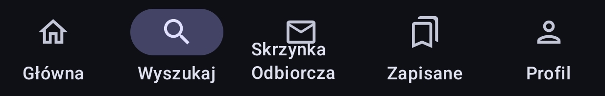
Strange layout in bottom buttons
Strange layout in bottom buttons
It looks like text wraps because it is too long, this ends up looking a bit off. Perhaps you can try scaling it down to fit the monitor width.
Cheers,
Hadriscus
You're viewing a single thread.
14 comments
-
At least center it maybe?
14 comments