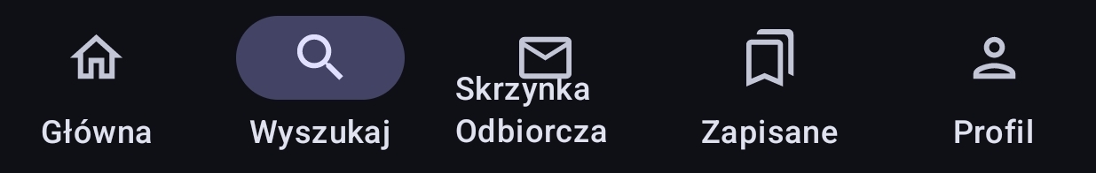
Strange layout in bottom buttons
Strange layout in bottom buttons
It looks like text wraps because it is too long, this ends up looking a bit off. Perhaps you can try scaling it down to fit the monitor width.
Cheers,
Hadriscus
-
Localization is hard
-
On one hand, you'd want a unified design with the same font size, spacing and kerning, on the other hand... Well, this happens
-
-
You can deactivate this text in the settings. I did the same because the German translation has the same issue.
-
It has been fixed for German though.
-
Thanks, in the meantime I switched to english.
-
-
-
there is an issue on github about that
-
Thanks, I'll chime in
-
-
At least center it maybe?
-
I agree, in French language the bottom text are wrapped up for 1 character, same here.
-
I suggested alternate words for the two problematic entries, what do you think ?
-
Good, but the old text with smaller font is pretty good too, I'll vote for the smaller font
-
-