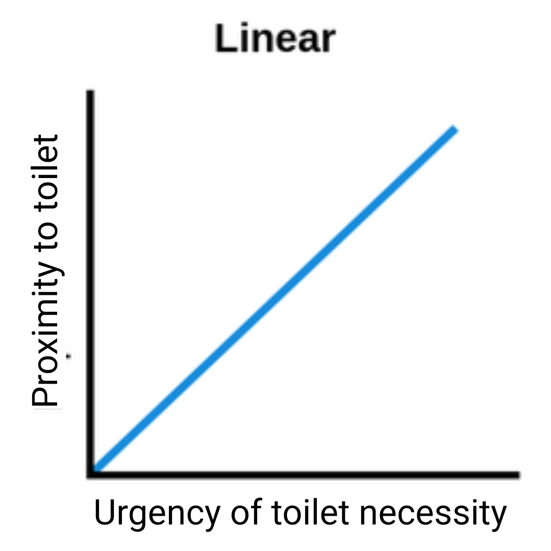
The Closer You Get, The Less You Can Hold It.
The Closer You Get, The Less You Can Hold It.


The Closer You Get, The Less You Can Hold It.


You're viewing a single thread.
This graph is saying the opposite of your statement. It should have a line going from upper left to lower right, to support your statement.
The graph says what OP says, the design is just poor. The left part of the line is low proximity (far away) and low urgency (easy to hold).
Why proximity rather than distance and why urgency is on the X axis rather than place or time for that matter, that I can not tell. That's beyond me.