The Closer You Get, The Less You Can Hold It.
The Closer You Get, The Less You Can Hold It.


The Closer You Get, The Less You Can Hold It.


You're viewing a single thread.
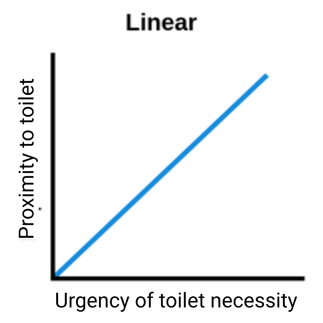
That's not how you read a graph. It doesn't say what you think it says.
As proximity to the toilet increases, the toilet necessity increases.
Typically you put your independent variable on the X axis and the dependent on the Y. It now looks as if the more urgently you need to go, the closer people get to toilets (which, while not linear, will probably also be correct)
Maybe the graph was created by an economist
True. I do like that it's funnier