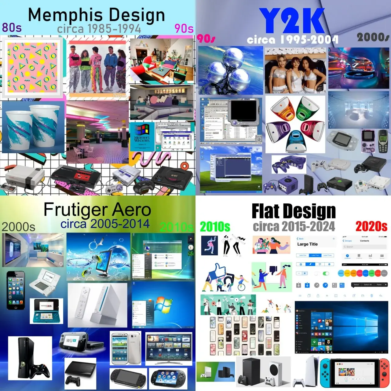
What Era was the best and why was it the 90s?
What Era was the best and why was it the 90s?


What Era was the best and why was it the 90s?


You're viewing a single thread.
Flat design is clinical depression in graphical form, a reflection of the contemporary existential/mental health crisis. It's a societal cry for help, basically.
Or smartphones and high pixel density displays became the norm, and raster graphics don't look good or scale well on them. Simple vector graphics are crisper on your screen, can be rendered via things like CSS, and can more easily scale to different resolutions and dimensions.
Apple's skeuomorphic phase overlapped the Retina display era, though, so I don't buy that explanation. Also, it's nothing to do with raster vs. vector. The photos that we take with phone cameras are raster graphics, for example. They look great, and it's because they're high-resolution. High-res raster UI elements would look great, except then the versatile manipulation by CSS would not be possible. Vector graphics are very good at that.
But here's the thing: Complex vector graphics exist, too. There were some pretty fancy PostScript graphics even back in the early 1990's. With all the pixels that we have now, we could have good design instead of flat, if the developers bothered. But it seems we've internalized the feeling that we're not worth the effort, aesthetics and color aren't interesting, and life is a joyless slog. Which sounds and awful lot like clinical depression...
(Incidentally, odd that emoji aren't flat design.)
(Incidentally, odd that emoji aren’t flat design.)
That actually depends on browser, app or OS that's doing the render. Apple and Whatsapp use the same design, Android uses a slightly different one, Discord and Microsoft both use flat designs, but for Win11 it's a different set
Interesting! I see what you mean, but while looking up Win11 emoji, I found this article from Microsoft about adding 3D design elements based on customer feedback. And, indeed, on my work computer (23H2), they're not-quite-flat anymore.
Seems more a rejects of the flamboyance of the prior two generation which will certainly give it a different feel. It absolutely felt fresh at the time of inception.
I’m ready for post-flat design.
I'd be so happy for a desktop window manager that didn't make all of the window borders grey-on-grey, and distinguish the active window by making the title text slightly-darker grey.
The irony is that you could go nuts with those color customizations on Windows 95-98-2000. Not to the point of active windows having different colors, but the title bar of the active window could be blue with red text, while inactives could be yellow with purple text, if you so wanted.
With Linux, you can customize your desktop until you pull your hair out.