💾 Save
💾 Save


💾 Save


You're viewing a single thread.
I think I've heard that Microsoft is replacing it though unfortunately (but I don't have a source, so take it with a grain of salt)
I also talked to a design student who said that the whole design community hated the current save icon, so we might be doomed to a new meaningless minimalistic icon.
Replace it with what? Nothing has that recognizability. Though professional software like photoshop and vscode kinda solve it by just placing it under file > save as with no icon. Ppl who use that generally know how to ctrl-s
In LibreOffice, the save icon for a while has been a colored arrow pointing down on top of a page icon. Arrow color changes based on if there are unsaved changes in the doc.
Personally, the save icon will forever be a 3.5" floppy in my mind.
So it's a download icon.
Design people and looking for ways to mess with perfectly fine stuff while pretending to innovate, how surprising.
Don't get me wrong, a good (UX) designer is always a godsend, but the amount of mediocre ones reinventing the wheel is staggering.
Reinventing the floppy disk
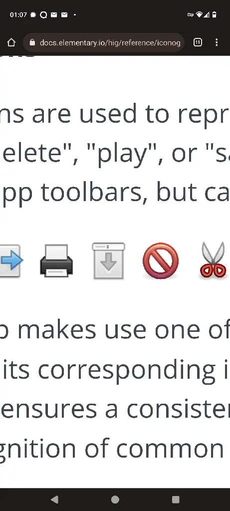
You're just jelous of their genius. Look at these design guidlines from the elementary os team. I mean what else can this window blind with an arrow mean?

/s
Are you trying to tell me that's not a trash can?
Washing machine
Finally a button to lower my projection screen!
Paper towel dispenser
what on earth could that icon even be at this point?
The same thing as every "design" minimalistic icon.
A cryptic symbol with no direct meaning I am afraid
A cryptic symbol with no direct meaning I am afraid
Isn't that effectively what the floppy disk is to most computer users today?
Not exactly. It can be confusing at first, but then you see that it's a standard in most apps, and you're fine. The most curious ones will look for more info and find the historical roots.
In other words, the floppy disk has meaning, just like most proverbs that come from ancient roots, but are still used and understood everywhere.
Well yeah, but not all computer users today.
An arrow pointing into a box, like the download icon. That's all I can really think of...
But what if the software has both options, to save and to download?
A vault or filing cabinet.🗄 Or, every file can track all the state-changes with every keytype or click and update the permanent file whenever there's a pause in activity.
But I like the floppy disk, and I've never used one.
I did, all of the first games I played came on floppy disks. We had big boxes with like 100 floppy disks that we would bring over to friends to let them play our games. With no internet and no mobile phone games, you can maybe imagine the feeling of having someone bring over tons of new games you never tried before. It was a really nice feeling that is a bit lost now since there are so many games everywhere.
I don't think thats true about the design community hating it. I think a lot of designers have a general fondness for it. I’ve been in Product Design for years and have rarely heard anyone hating on it.
I'm glad to hear that
I was looking for 1 in my old pc junk boxes, to show my 12 year old what they looked like. Not a single floppy survived.