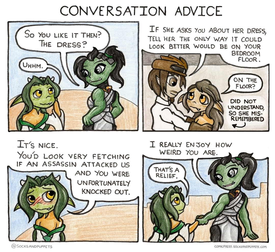
Oh yeah, any attempt I make to do a shade over the art in the physical media is doomed to failure - the pencils I use are acrylic coloursofts, they have a very vibrant pigment that goes down very fast and in great volume, which is great for comic work, but... they don't blend at all well. I know which specific pencil to use for each part of each character, and shifting them all to new shades would be a mess - so the simplest thing to do is to just digitally stick a layer on top with a colour shift.
In a related issue, for few of these comics both before and after this, I've applied some "glow" lighting in some panels. That's digital too, for similar blending reasons. Here's an example of what that looks like in practice:
Shading the bubbles manually would work, but at the time I did this comic, I was hand-lettering all the speech bubbles, and shading the bubble tends to destroy the readability of the text. The previous comic had shaded text boxes, and you'll see I used a digital font for it, because the hand-lettering I'd used was unreadable.
However, a couple months after this comic, I got fed up of the amount of cleanup I was having to do for text in every comic, and I ditched hand-lettering for making my own handwriting into a font. It's not perfect (I should really get a professional to make a good one with decent kerning) - so now I could shade bubbles and apply that font, and it'd work.
I'd honestly not considered shading the whitespace bubbles for flashbacks - my priority for text is always legibility first, any impediment to that means effort to read, which is to be avoided in comics at all costs. (I could get into discussing the medium at length here, but the tldr is that "it doesn't take much effort to read and understand" is the main strength of comics, and you degrade the experience massively if you do anything that gets in the way of that. see Scott McCloud: understanding/making comics for further reading :) )
However, it's a good idea here, if the whole panel including the bubble was "shaded" then it'd be a stronger visual marker that it's a sepia panel - and that'd reduce the chance of confusion significantly - which is worth doing.


