Introducing Alexandrite for Lemmy, a desktop-first alternative web UI
Introducing Alexandrite for Lemmy, a desktop-first alternative web UI
I've been working on an alternative web UI for Lemmy for a couple weeks now and it's got enough features I wanted to share it. I love that somehow people have found it despite me never having posted online about it until now (until a couple days ago it was called sx-lemmy, sx being an abbreviation of my username) so you might have seen it in a list already.
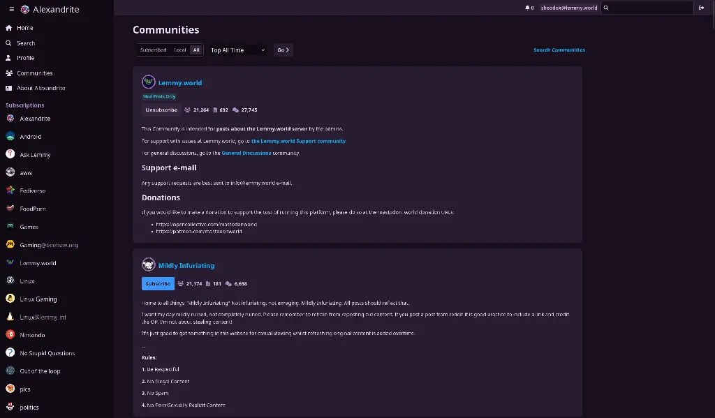
Alexandrite is a (for the moment) desktop-first Lemmy interface, I primarily use Lemmy on my computer and I wanted a more convenient way to view posts and comments without juggling tabs or losing my place in the feed (with infinite scrolling). It's still very much in beta, and I have a lot of work to do still, but it's got most of the basic features.
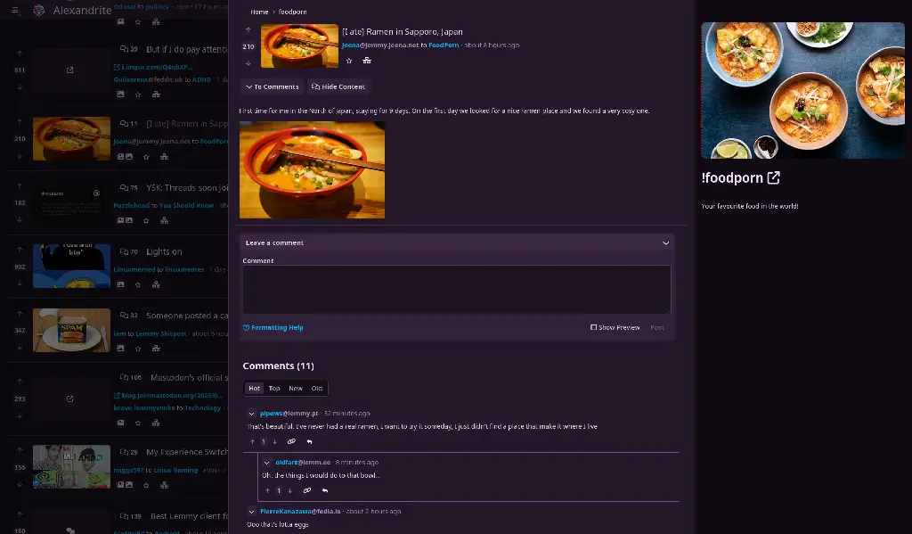
You can view a post and comments in an overlay without losing where you scrolled to:


A non-exhaustive list of things you can do:
- view home/community/user/communities feeds
- post/comment
- subscribe to communities
- vote
- save posts
- search
- inbox stuff
Noteworthy missing features:
- reporting
- blocking users/communities
- mod tools
- image uploading
- automatic linkifying of urls/communities/users in comments/posts
For those who care, it's all Sveltekit which is a dream to work with. Alexandrite is the name of the kind of gem in my wife's wedding ring, it looks cool and changes color in the light.