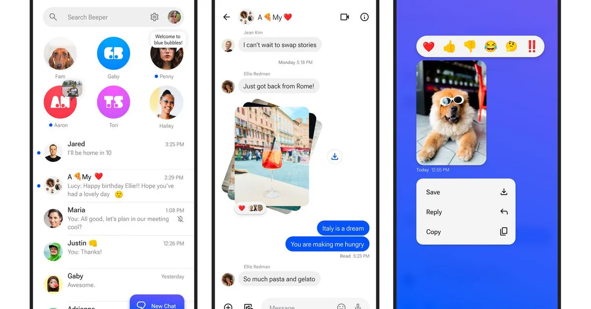
If you own an iPhone, when you're texting with a person who uses iMessage, your outgoing messages have a blue background. When you're texting with someone who doesn't or can't use iMessage (usually because they use an Android device) your outgoing messages have a green background. And since the message backgrounds are kind of shaped like speech bubbles from comics, they're called bubbles.
The design is noticeably worse for the green bubbles; the contrast isn't as good and the color scheme doesn't seem to match as well as with the blue bubbles. And the fact that it's the iPhone users' outgoing messages—not the message of their recipient—that show up in this lower-fidelity way has a pretty powerful psychological impact.
Ostensibly the color difference is so that users know when their messages are being encrypted. But in reality, it seems pretty clear that Apple keeps this in place as a marketing tool, to encourage peer pressure so that users encourage other users to get iPhones.
And it works. Studies and reports keep coming out showing that, among high school students particularly, peer pressure against Android users is considerable; and even for adults, it's not uncommon for Android users to be left off of group texts entirely.
There are other, more meaningful differences: like the fact that non-iMessage users receive photos and videos in much worse quality (which Apple's upcoming RCS support should fix), and chats are only end-to-end encrypted between iPhones (which Apple's implementation of RCS probably won't fix). But the green and blue bubbles (which RCS definitely won't fix) are, by Apple's design, the thing that everyone is hung up on.